Customizing Themes
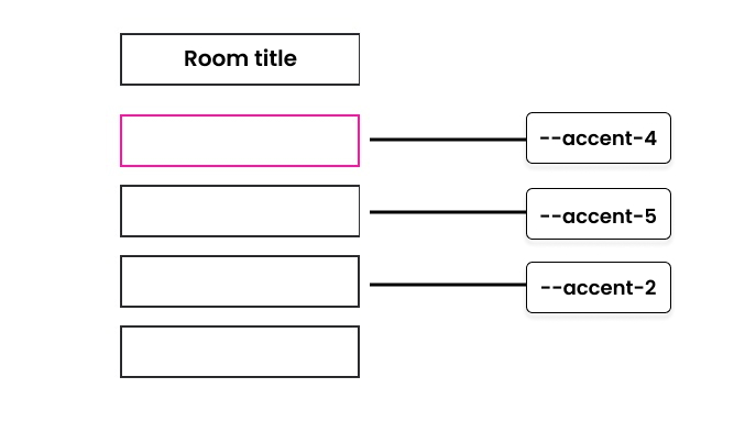
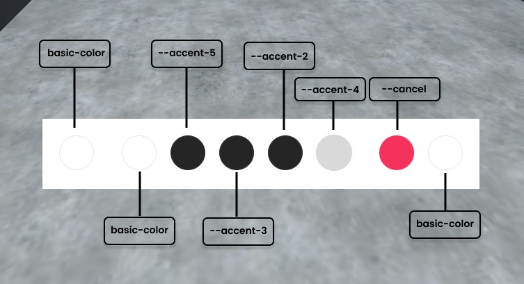
Theming refers to the colors used in your metaverse’s interface. For each color in the UI, there is a variable that stores the color value and is applied to UI Elements such as buttons, input fields, menus, etc.
Theme JSON
You can add completely customized color schemes from the Admin Panel by copying and pasting a theme JSON, like the example below:
[
  {
    "name": "Metaverse",
    "id": "metaverse-dark-mode",
    "default": true,
    "variables": {
      "loading-screen-background": "radial-gradient(50% 50% at 50% 50%, #15171B 0%, #282C31 100%)",
      "accept-color-pressed": "#F1580C",
      "primary-color-hover": "#F79A6B",
      "primary-color": "#F1580C",
      "primary-color-pressed": "#F1580C",
      "outline-color": "#ffffff",
      "basic-color": "#3A4048",
      "basic-color-hover": "#4B5562",
      "basic-color-pressed": "#636F80",
      "basic-border-color": "#fff",
      "secondary-color-pressed": "#282C31",
      "accent1-color": "#2B313B",
      "accent1-color-hover": "#5D646C",
      "accent1-border-color": "#ffffff",
      "accent1-color-pressed": "#21242C",
      "accent2-color": "#2B313B",
      "accent2-color-hover": "#5D646C",
      "accent2-color-pressed": "#21242C",
      "accent2-border-color": "#ffffff",
      "accent3-color-pressed": "#21242C",
      "accent3-color": "#2B313B",
      "accent3-color-hover": "#5D646C",
      "accent3-border-color": "#ffffff",
      "accent4-color": "#F1580C",
      "accent4-border-color": "#F1580C",
      "accent4-color-hover": "#F79A6B",
      "accent4-color-pressed": "#F1580C",
      "accent5-color": "#2B313B",
      "accent5-border-color": "#ffffff",
      "accent5-color-hover": "#5D646C",
      "accent5-color-pressed": "#21242C",
      "admin-color": "#F1580C",
      "text1-color": "#ffffff",
      "text1-color-hover": "#E7E7E7",
      "text1-color-pressed": "#DBDBDB",
      "text2-color-pressed": "#DBDBDB",
      "text3-color-hover": "#C7C7C7",
      "text3-color-pressed": "#ADADAD",
      "text2-color-hover": "#F5F5F5",
      "text2-color": "#E7E7E7",
      "text3-color": "#BBBBBB",
      "text4-color": "#BBBBBB",
      "secondary-color": "#3A4048",
      "secondary-color-hover": "#5D646C",
      "border1-color": "#3A4048",
      "border2-color": "#5D646C",
      "border3-color": "#5D646C",
      "active-color-hover": "#F79A6B",
      "active-text-color": "#2B313B",
      "active-color-pressed": "#F79A6B",
      "background1-color": "#2B313B",
      "background2-color": "##2B313B",
      "background3-color": "#3A4048",
      "background4-color": "#5D646C",
      "accept-color": "#2B313B",
      "accept-color-hover": "#5D646C",
      "accept-border-color": "#F1580C",
      "background-hover-color": "#aaaaaa",
      "input-bg-color": "#21242C",
      "tip-text-color": "#ffffff",
      "tip-bg-color": "#21242C",
      "tip-button-color-hover": "#F79A6B",
      "action-color": "#F1580C",
      "action-color-highlight": "#F1580C",
      "action-label-color": "#5634ff",
      "notice-background-color": "#000000",
      "toolbar-icon-selected-bg": "#4B5562",
      "toolbar-basic-icon-color": "#ffffff",
      "toolbar-basic-color-hover": "#F79A6B",
      "toolbar-label-accent1": "#ffffff",
      "toolbar-label-accent2": "#ffffff",
      "toolbar-label-accent3": "#ffffff",
      "toolbar-label-accent4": "#ffffff",
      "toolbar-label-accent5": "#ffffff",
      "link-color": "#F1580C",
      "link-color-hover": "#F79A6B",
      "link-color-pressed": "#F1580C",
      "tab-highlight-color": "#F1580C",
      "border-radius-regular": "200px",
      "border-radius-small": "20px"
    }
  }
]
Use the boolean attributes, default and darkModeDefault to set a default theme from your custom themes array.
Theme Variables Guide
While not exhaustive, these diagrams will outline a few key variables that you can use in your themes.
Entry Screen

Bottom Toolbar

In-App Themes
The in-world User Interface (e.g the menu you get when hovering your cursor over an object and pressing the spacebar) is themed with the following variables: "action-color", "action-label-color", "action-color-disabled", "action-color-highlight", "action-text-color", "action-subtitle-color", "notice-background-color", "notice-text-color", "favorited-color".
Learn about Themes
You have access to a variety of excellent tools that can assist you in gaining a deeper understanding of theme-ing your metaverse.
To expand your knowledge of working with JSON, you can refer to the MDN Web Docs, which offers comprehensive resources and documentation on this topic.
In addition, Storybook is an invaluable open-source tool specifically designed for developing UI components and isolated pages. It proves particularly helpful when it comes to customizing themes. To preview components and themes locally, you can utilize the command npm run storybook.
By exploring these tools, you'll be equipped with valuable insights and practical experience that will enable you to effectively theme your metaverse. As a result, you'll have the ability to create a unique and visually appealing virtual environment that aligns with your preferences and branding.